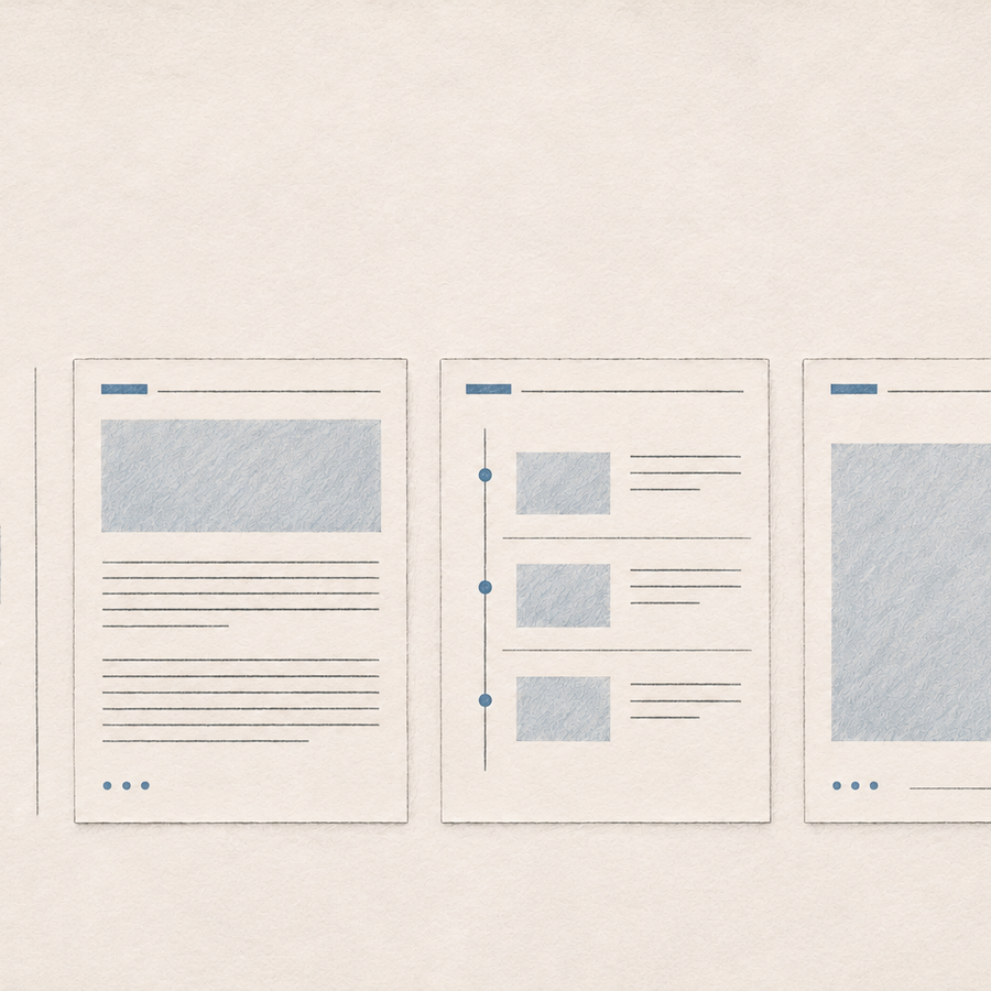
Click Export in the Reedapt editor and a little message appears in the top-right corner. That used to be the same corner as the Export button. If another message came in, it went right below the first. On a phone, the stack could cover the header.
We'd spent months making those notifications look better. It took us longer to notice that they were in the way.
We kept changing the card
In June we gave the standard notification our colours. In September we added a button so you could act on a message, and fixed the font. We took another pass at the styling in November. The card looked better each time, but it still opened in the same corner.
It also had a lot going on for something as simple as "Link copied." A tinted tile sat behind the coloured icon, and a line at the bottom counted down until the card disappeared.
Once we started paying more attention to when the cards showed up, three things stood out:
- They covered controls. Export was one example. The account menu and the sign-in button on Live were in that corner too.
- They piled up. Four messages could take up about a third of the screen.
- Everything had a countdown. Even a copied link set off a little progress bar, though there was nothing left to do.
What we tried first
We tried a quiet card, a dark pill that changed shape as work finished, and a bar tucked into the corner. We ran them with the same notification library on actual Reedapt screens, at desktop and phone widths, in light and dark.
The pill was useful because a quick message didn't need the same amount of room as a finished dub. But changing the shape still left us writing a sentence about something we could just show you.
Take a finished dub. At that point, the interesting thing isn't that a job has a new status. It's what the speaker sounds like in French. We wanted you to be able to hear that without opening the editor.
We put together ten smaller prototypes using Reedapt projects and messages. That let us try out specific ideas, like how a short message expands or where a preview belongs, without committing to another whole layout.
One spot for notifications
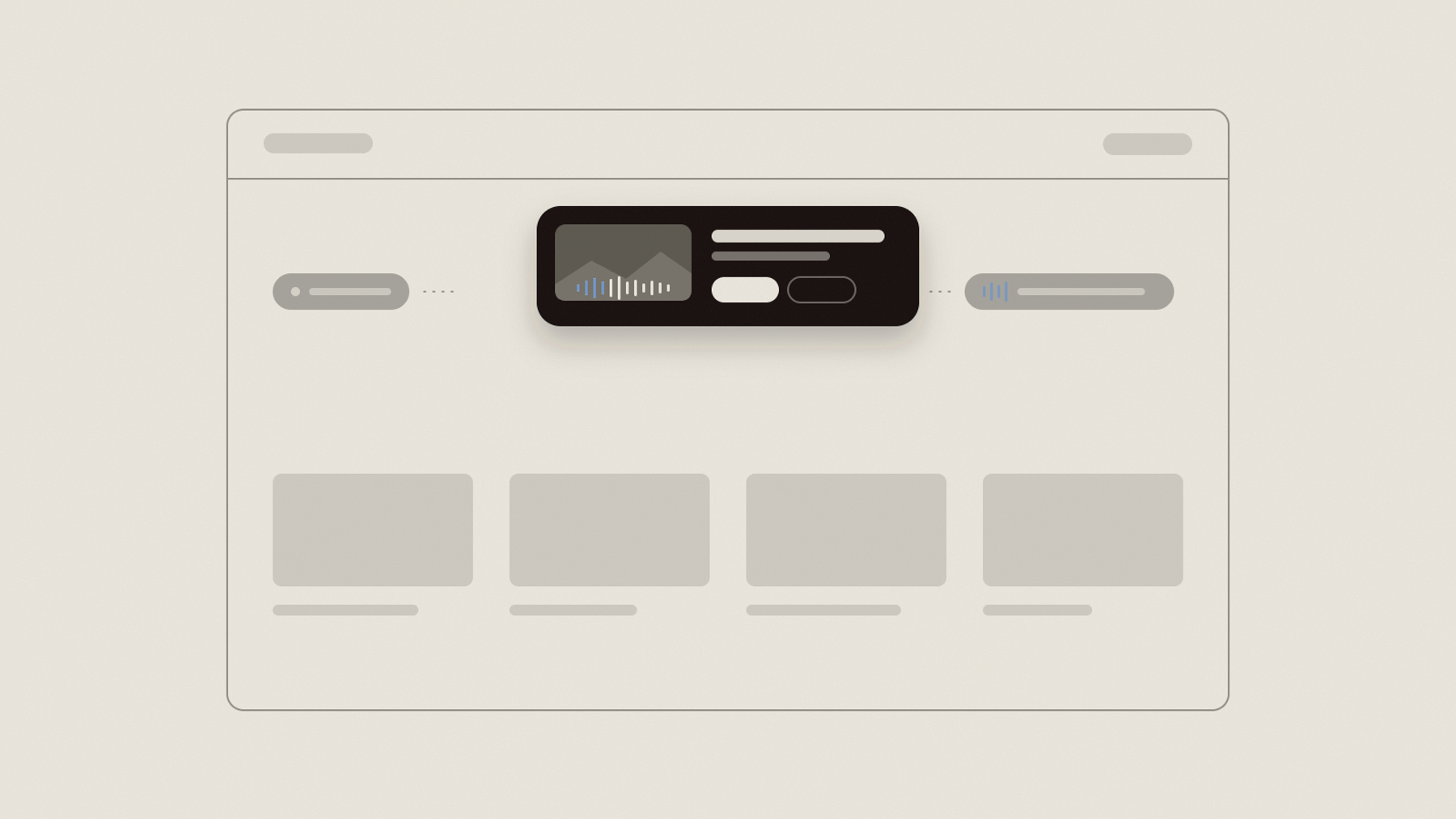
The new notification sits below the header on desktop and near the bottom on a phone. We call it the island.
"Link copied" gets one line. A finished dub with a thumbnail and a play button gets more room: the same panel grows into a card. A new message can take over that spot, but an unread failure or a dub still in progress can come back once the newer message clears.
Choose a message. It appears on the island itself, not inside this box.
We kept the panel dark in both themes. It looks the same whether you're working in the light editor or watching a video in dark mode.
You can hear the dub right there
While a dub is running, the little bars in the notification move. They settle when the work finishes.
The message comes in like a caption. If your interface is in English and the dub is in French, you'll see "Your dub is ready" followed by "Votre doublage est prêt." If the languages already match, we don't repeat it.
The card shows the video's thumbnail and the dub language. Press Play and you'll hear the first line that's been voiced. The preview loads that recording the same way the editor does, so it can reuse it if you open the dub next.
Retry without leaving the card
When there's a retry available, you can start it from the failure message. The button shows a spinner while it runs. If the retry succeeds, that same card updates, so you can see what happened without looking for a second notification.
When several dubs finish
If several dubs finish as a batch, their thumbnails show up together. Hover over the card to see the list.
We also moved the progress indicator into the island. It used to sit in a separate pill at the bottom right. Now you can see the current step, like "Generate voices," and expand it to check the progress.
How long a message stays
Short messages get three seconds, cards get seven, and failures get ten. The timer pauses while you hover, focus the card with the keyboard, play a preview, or switch to another tab.
On a phone, swipe down to dismiss the notification. If the keyboard or a bottom sheet opens, the notification moves to the top so you can still see it.
We missed the header by one pixel
The island looks for a header pinned near the top of the window so it knows where to sit. In the first version, "near" meant within eight pixels.
On the Projects page, the content panel is inset and the header starts nine pixels down. We caught it on release day: the island was sitting over the header instead of below it. We bumped the limit to 24 pixels and shipped the fix that afternoon.
The existing messages still work
The code that sends a notification still passes the same title and, when needed, a description or button. We didn't have to rewrite hundreds of messages to move them. Only the new finished-dub and batch cards need extra details, like the thumbnail and the dub language.
We used Claude to help build and test the prototypes. We also checked the results on actual Reedapt screens, at desktop and phone widths, in both themes.